As you know, MAS Monitor comes with an increasing list of functions that can be used to generate calculated metrics (and alerts) based upon the raw data streams coming into the system. Some of these functions are quite sophisticated and do require a bit of data science study to fully understand what they are doing. Others are more utilitarian and can easily be used to your benefit. The models are grouped as: Transformers, Aggregators, and Data Sources.
We will briefly cover:
- AlertOutOfRange
- Last
- Mean
- Filter / PythonExpression
- AnomalyDetector
- GeneralizedAnomalyScore
Exhibit A is from a Device definition within Monitor where you construct the “metrics” you wish Monitor to show you based upon the raw data streams coming in from the Devices. Given some set of data elements coming in from the Devices, you can construct quite a long list of metrics that simply follow the incoming data.
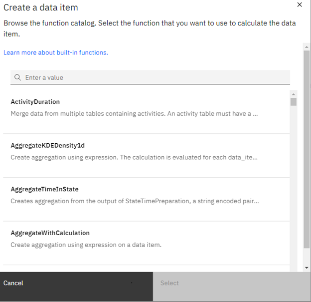
EXHIBIT A
Alert Out of Range
This function will generate an Alert when a metric exceeds an upper threshold or goes below a lower threshold. It is as simple as selecting the data element within your data stream, the upper and lower thresholds, and the severity you wish the Alert to be. Further, you can give the metric(s) a specific name.
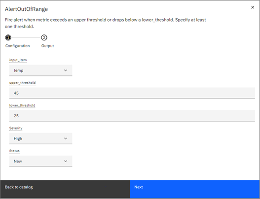
EXHIBIT B
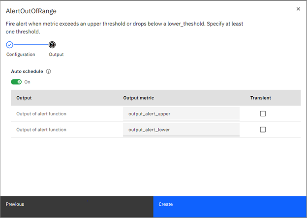
EXHIBIT C
Now when data comes in for the data element that exceeds the thresholds, an Alert is generated, and you can see it in the Monitor visualizations.
Last
As the name suggests, this function always delivers the last value of the selected data element. Pick the data element and give the metric a name.
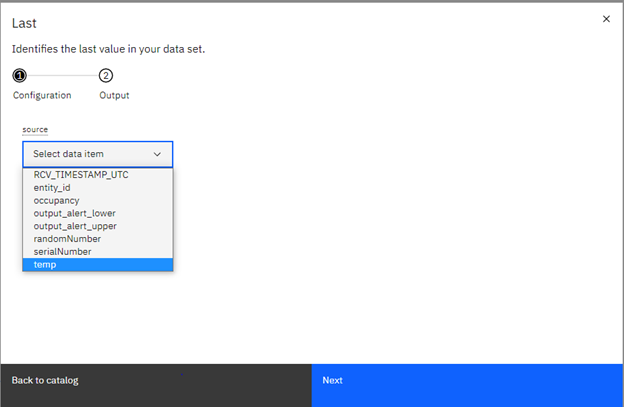
EXHIBIT D
Note in EXHIBIT E that you can also set the granularity (the time range) that you will get the “last” value from.
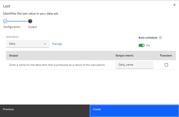
EXHIBIT E
Mean
The Mean function does just that… it calculates the mean of the to-date raw data property (data item) you select. In the case below, we are going to produce the mean of the CO2 readings ingested thus far. Once the metric is defined, it is available to be displayed in a tile on a Monitor dashboard.
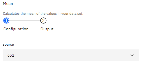
EXHIBIT F
Now we give the calculated metric a name:
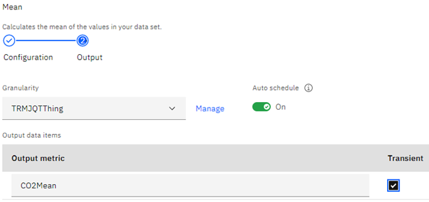
EXHIBIT G
Filter / PythonExpression
While these two functions are rather different, they use a common language to perform their functions. In the case of Filter, it assumes you are going to refer to a data item using Pandas notation, and then whatever Python script to then filter the data according to criteria. FYI… ‘df’ stands for data frame in Pandas-speak.
For example, if the data item you wish to filter is ‘co2’ then the syntax will be:
df[‘co2’]
If you then wish to only show CO2 levels above a certain level, then the full expression will be:
df[‘co2’]>450
For the full PythonExpression function, you can create data items within the Python script, often because of a calculation. The created data item is the name of the metric.
A simple example is multiplying two data items:
df[‘co2’] * df[‘ratio’]
AnomalyDetector
This function predicts values for output variables using a regression model. If for example you have two data items; one for oil temperature and another for coolant temperature, they might have a relationship to each other. As the coolant temperature rises (the variable the target is dependent upon), so should the oil temperature (the target). If a value comes in for the oil temperature that is outside of a set threshold/prediction vs. the coolant temperature, an anomaly exists, and an alert is generated.
Setup is rather simple. Choose the target data item(s), the dependent(s)… called features… then establish the threshold. Given the metric a name.
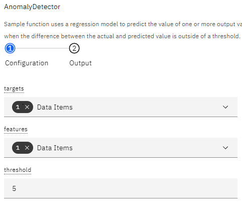
EXHIBIT H
Visualizing the data stream trends will take a while for the function to begin to predict values.
EXHIBIT I
This function is very helpful if you have known relationships between data items and your devices are very verbose. It helps you to focus your reaction to the incoming data to only those values that are truly out of range.
GeneralizedAnomalyScore
This function identifies outliers in the raw data being received for a particular data item, during a specific time window. Further, you can filter the scope of the metric to type, dimension (meta data) or a Python expression.
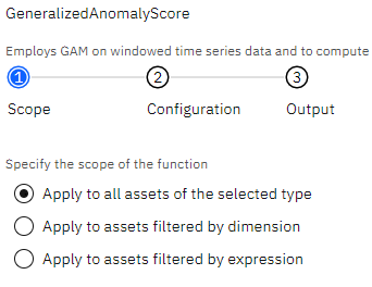
EXHIBIT J
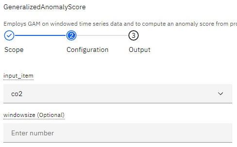
EXHIBIT K
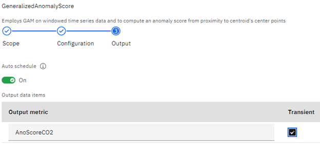
EXHIBIT L
The output of this function is a scoring of the incoming values as to their degree of “anomaly,” from the expected values.
Wrapping up
The Monitor element of Maximo Application Suite brings to us a significant number of functions to visualize equipment data and make decisions from. Given the vast amounts of data we could be receiving and using, the built-in functions of Monitor give us many choices as to how we manage this data and make real use of it. Beyond just responding to alerts, these functions give us insight into trends and patterns that perhaps we never knew existed.
Let TRM show you how Monitor plays a role in your reliability and asset goals.
Article by John Q. Todd, Sr. Business Consultant at TRM. Reach out to us at AskTRM@trmnet.com if you have any questions or would like to discuss deploying MAS 8 or Maximo AAM for condition based maintenance / monitoring.
0 Comments